

Marketing
The White Bunny
How the small things make the biggest difference in life, love, and business, plus why microcopy is actually a big thing.
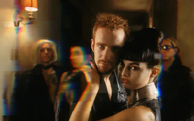
Websites that try too hard lose users, and money. And get you burned out. Here, some simple, solid advice to trim digital fat and reduce clutter plus Van Gogh-related gossip, and a great meme to turn digital lemons into gold, easy peasy.
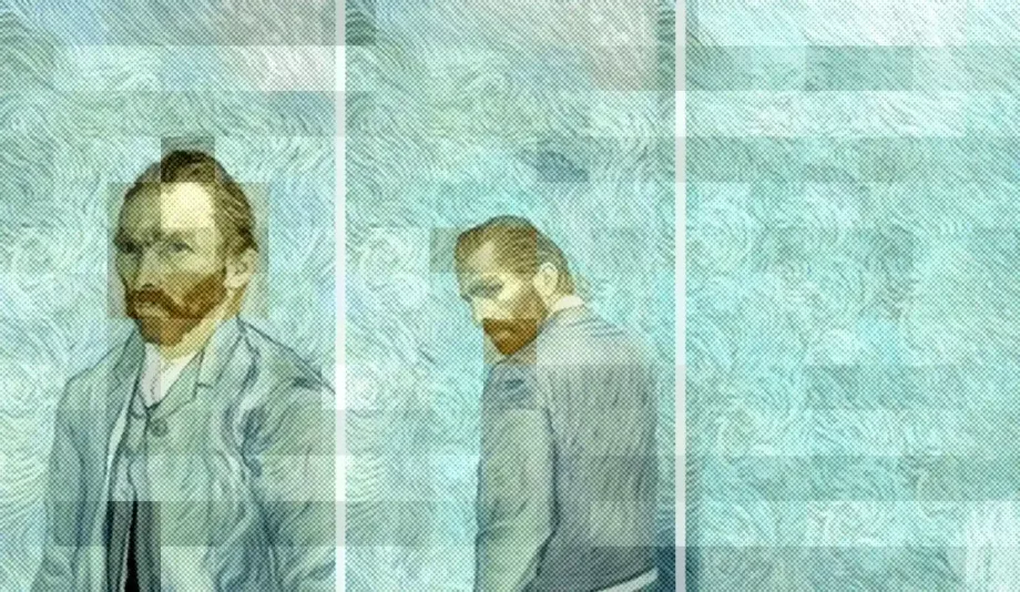
In the summer of 1881, the young painter fell madly in love with his cousin Cornelia Adriana Vos-Stricker, or “Kee”, for usability purposes. Vincent’s timing sucked, because Kee was recently widowed, not in the mood to entertain clingy relatives and, most importantly, had zero interest in the stubborn artist.
Her response to his declaration of love was a succinct “Never, no, never”. Not much room for interpretation.
But Vincent was a very passionate young man refusing to accept defeat who set out to Amsterdam to prove his resolve. When Kee’s father stood in the way, blocking him from seeing her, Vincent placed his hand over a candle, vowing to burn until he was allowed in. The dramatic stunt failed, and he quite literally burned out of love.
This episode was just a chapter in a life of brilliance, verve, desperate creative urge, beauty, and wonder. He was mentally ill and struggled all his life. In love, art, friendships, work discipline. And he always tried too hard.
Our websites try too hard, too.
Lend me your ear and I’ll tell you why.
Navigation. Announcement bar. Megamenu. Toll free number. Client portal. Distributor login. Live chat. Push notification. Scrolling banners. Most popular. Featured. New items. Search. Cart. Catalog. Promo banner. Showstopper. SEO Rich text. Product list with filters. Latest news. Social links. And feeds. Popup.
Our websites are a cluttered mess. We put attention, time and money into acquiring visitors, only to dump them into this modern digital house of hoarding, trusting they’ll know their way because “clutter” is now the default, and we’re all used to it, right?
We sure are, but wrong.
Clutter is friction. Waiting equals broken. Very wrong.
This relates to Key Aspects of Ecommerce UX Design
Did you know that Van Gogh used to re-paint the same canvas over and over to save money?
Adjusting your design, over and over, has the same effect. Some ideas:
Those big images scrolling at the start of your website? Yeah, no. The NN Group proved long ago that the first slide takes all the attention with 40% of the clicks. You’re splitting efforts in the most important real estate above the fold, running scripts and loading big images.
Big names like Amazon told us years ago that loading speed equals success. 1% faster load = 1% more sales.
Trim your homepage weight for a few weeks. Defer scripts that aren’t immediately needed for the user experience, prioritizing essential content and loading non-essential scripts asynchronously in the background, and measure results. Tools like Google Tag Manager make this simple.
9 in 10 buying decisions are influenced by aesthetics. Design quality creates credibility because we are wired to associate beauty and harmony with desirability. But beauty alone isn’t enough.
We’re fighting for attention, and bleak writing leads to bleak sales. Say what matters early, clearly, and attractively, because ultimately, websites are ads. Not in a modern PPC sense, but like Mad Men-era, old-school, full-page Sunday spreads.
Combine design and storytelling to create a site that resonates with your audience. Test your copy and visuals to see what makes them click.
This relates to On Copywriting that doesn’t suck.
Users gonna use. Different people take different paths. Some will love a big menu with many choices. Others will feel decision paralysis. Or open twenty products in separate tabs. Or go straight to search.
Not knowing how your site is used means you can’t improve it. Learn what they do. Consider Clarity or Hotjar.
This relates to Fixated on fixing
43% of US online shoppers abandoned a cart within the last 3 months for being “just browsing / not ready to buy”
BaymardDriving new visitors is a big effort. 1% to 3% of them will buy. Half will flee. The other 47%? Reasonably indifferent. Just browsing. Use design to funnel them to your best content. Capture their attention and data to build up a relationship until they’re ready.
This relates to Every pixel is a billboard
Extra expenses like taxes and shipping costs cause 39% of visitors to leave.
We’ve all been there. You like something that’s $40. With taxes, it becomes $48. Suddenly, it’s no longer attractive.
Set clear expectations — about extras, shipping timeframes, returns, guarantees, fractioned payments. Make this information visible, clear, easy to understand, and ubiquitous.
While I never felt the urge to slice my ear or anything even remotely dramatic, I’ve been thinking about Van Gogh lately. Maybe because we live in colorful, crazy times. The kind that can make us try too hard, and figuratively and willingly burn ourselves out.
We should make the most of our efforts and simplifying is key to achieving that.
It’s better to have an unfinished website that works, looks good, and sets clear terms, and that you can retouch periodically, over an eventual masterpiece that makes anyone looking at it for more than 15 seconds want to paint it black.
How the small things make the biggest difference in life, love, and business, plus why microcopy is actually a big thing.
With new tech popping up left and right, B2B ecommerce evolves faster than you can say "shopping cart." What that means for eCommerce design? Glad you asked.
Because design is how it works, and how it makes you feel, ecommerce web design is also about differentiation and positioning.
Imagine having free ad space on a channel that’s perfect for your audience, for as long as you want to.


